I don't see a problem with that at all; sharpening is always a bit hit-and miss, because what looks oversharp on a screen may be great on paper. Work to the medium

As far as the lens goes, yes, it might not be that good, and there's not that much you can do. OTOH, it's nice to be aware of the limitations.
bit more philosophical...
Natural representation? why?

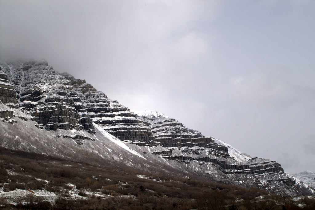
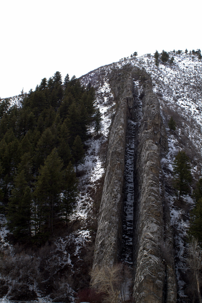
I'm always trying to make the nature pic *tell* me something; for me it's not about how dramatic the scenery is - everyone else can try that, I'd prefer the details, the little line that screams "TREE" or "MOUNTAIN" - the detail that leaves you in no doubt what you are looking at, even if the rest of the object is obscured. The cliffs on the top one fall into that category - it's ancient and proud and vivid and very real at the same time. Majestic, braving the weather.... and yet humbling.
I miss mountains.
In my photography, I like playing with people's perceptions of what they're seeing and why; I'd like them to not necesarily be 100% sure what it is but to realise and then realise that with *conviction* that's what I was looking at and trying to capture.
Bit like Audio, really; you don't really recognise excellent SQ until you hear it. And then when you lose it, you really miss it, and want it back.
Anyways, back to Topic --> this is the kind of thing I really like - took me a good half hour or so of lighting playing and exposure changes:
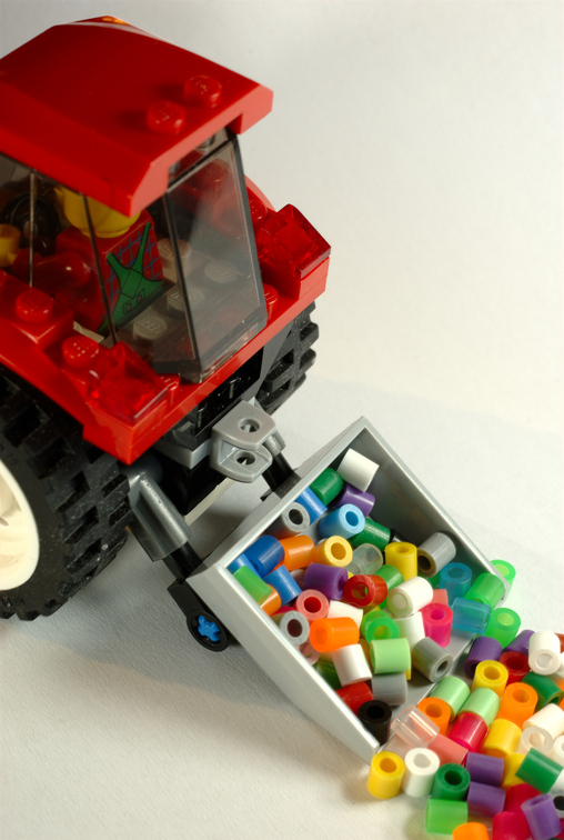
It's for a simple comp - theme "colours".
Bret