Today, they looks like this:
http://phoenixphorum.com/one-pic-of-my- ... 14730.html
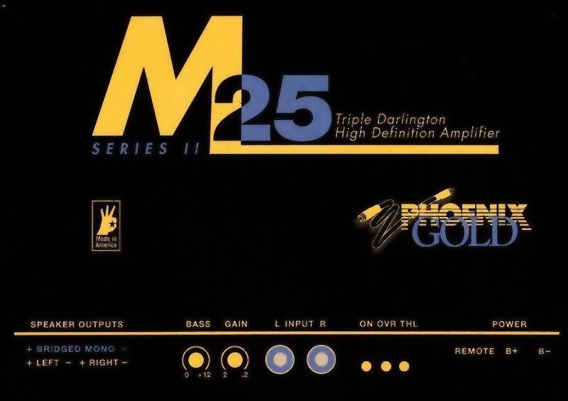
"I had" this Ideas to make it match themselves: (I really loved that Black/Gold M25 shown by Zak Davis (AAMP217)

Or, I thought that could looks nice If I change this original Phoenix Gold "logo" to this one:

About this last "logo", I really like this color matching (Pink/Blue/Black), so I thought that would be a nice color schem to make on the amp, with a brillint/reflexive black background with a blue"M" and all the little writing gone pink ("series II", "triple Darlington...").
What you guys have to say to me about it?
Can someone help me with photoshop mods on this pics? I'm feeling like I'm in the rock's age. I dont have Photshop software, also I don't know how to work with it.
Thanks!
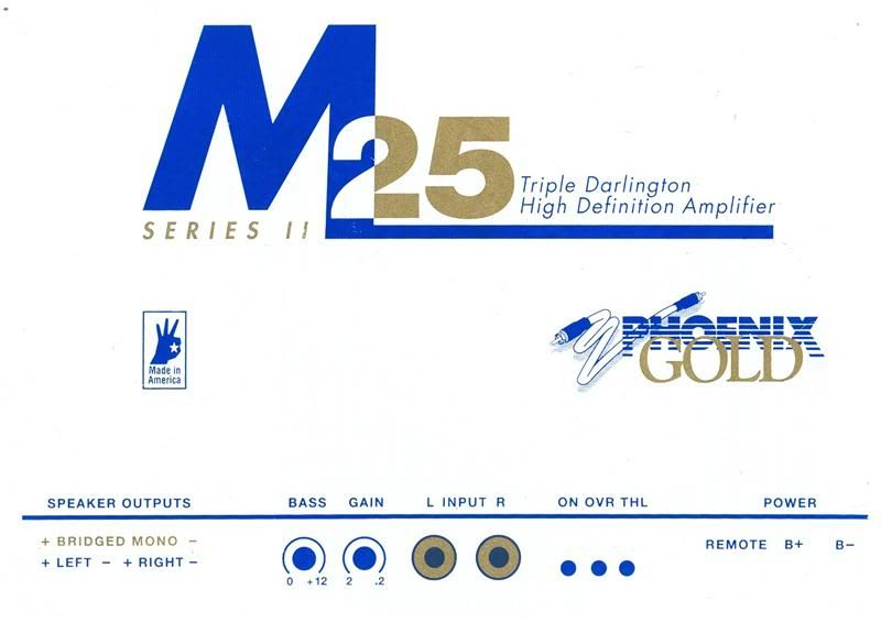
Edit: OEM ArtWork ---------->
