okay now guys- simmer down!
dont go getting your undies all bunched up...
this is still only my first real attempt at this detailed work...
I have learned tons from doing this one excersise....
1) not going to peace meal it ever again
2) perhaps having that solid line across the amp would 1) have it look better 2) give me a registration point to go/work from so it isnt cock-eyed like it is here and hopefully any one i do from here-on-out doesnt look like it is from the simpsons. No i didnt use the simpsons font, but the alignement issues i had caused it to be a little crooked here/there
3) lastly i would reduce the font size next time. I wanted to go bigger with this project intentionally, as i didnt have / dont have any other writing or text on the cover, so i wanted to phaten up the font a lil- but not ever again- makes it for it to be too crowded.
bottom line is that- while this doesnt look so so bad... i think given my learning expiriences i had with the first one here will only make me better at any in the furture.
I wanted to do one of my own first so i wasnt doing it on someone that had paid money for it... i wanted to get my feet wet and see what the ins/outs were... so granted there are some issues, i think it still looks pretty good.
so there it is... i am happy- if i didnt learn anything that would be the bummer
I have a half of mind to do it over again- My QC threshold is way high, and this just doesnt make the cut...IYAM IMO-
i need to sleep on it...
i do have another 66, but that was gonna be an OEM restore
- but still- i think i would like to do this one over again-
which means stripping/blasting, and coating again-
i dunno need to sleep on it and hear what you guys have to say perhaps
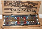
RTE 66 ARTWORK Z228R's- RTE 66 COMPLETED!
-
mhyde71

- Dr. Jekyll
- Posts: 6231
- Joined: Sun Jan 20, 2008 8:34 pm
- Location: PG FanBoy in Green Mtn Vermont
- Contact:
RTE 66 ARTWORK Z228R's- RTE 66 COMPLETED!
- Attachments
-
- img_5524_189.1.JPG (43.57 KiB) Viewed 8953 times
-
- img_5507_127.jpg (151.66 KiB) Viewed 8953 times
-
- IMG_5980.jpg (130.5 KiB) Viewed 8958 times
-
- IMG_5979.jpg (161.83 KiB) Viewed 8958 times
-
- IMG_5978.jpg (140.78 KiB) Viewed 8958 times
-
- IMG_5977.jpg (216.62 KiB) Viewed 8958 times
-
- IMG_5976.jpg (151.79 KiB) Viewed 8958 times
-
- IMG_5974.jpg (181.79 KiB) Viewed 8958 times
-
- IMG_5973.jpg (179.26 KiB) Viewed 8958 times
-
- IMG_5972.jpg (155.69 KiB) Viewed 8958 times
-
- IMG_5946.jpg (152.19 KiB) Viewed 8958 times
-
- IMG_5945.jpg (128.5 KiB) Viewed 8958 times
Last edited by mhyde71 on Sat Sep 25, 2010 9:09 am, edited 6 times in total.
PAST WORK/S HERE::
https://www.facebook.com/KhameleonKoatings/photos_albums
https://www.facebook.com/KhameleonKoatings/photos_albums
-
mhyde71
- Dr. Jekyll
- Posts: 6231
- Joined: Sun Jan 20, 2008 8:34 pm
- Location: PG FanBoy in Green Mtn Vermont
- Contact:
thanks money B / bri! i appreciate it...
it can and will only get better too!
i mean it's not bad... and perhaps i am a lil hard on myself... but seeing it up in person, and with your nose in it, you can see the small miss-alignments, and/or subtle errors like on the x-over icons... one has the center slot shifted to the right too much- just a simple error in/when i designed it up...
but practice makes perfect, and for the first one i guess it's not that bad...
thanks B
m
PAST WORK/S HERE::
https://www.facebook.com/KhameleonKoatings/photos_albums
https://www.facebook.com/KhameleonKoatings/photos_albums

-
The Golden One

- Quarantined

- Posts: 717
- Joined: Sat May 29, 2010 3:58 pm
- Location: Tinkle Town T,N
-
mhyde71
- Dr. Jekyll
- Posts: 6231
- Joined: Sun Jan 20, 2008 8:34 pm
- Location: PG FanBoy in Green Mtn Vermont
- Contact:
oh and you guys notice that disclaimer on the back
see the last line in there...?
think we might do that for any restored amp that goes through eric and my hands. obviously if just mine then it would state that accordingly, but this rte 66- which is for sale once i get clear coat on it and all back together...but that wont be until tomorrow
but thanks guys!
i wasnt going to go with this font... but seemed to be the most fitting for car, speed, fast, auto type font- isnt it?
magneto it's called i think IIRC
PAST WORK/S HERE::
https://www.facebook.com/KhameleonKoatings/photos_albums
https://www.facebook.com/KhameleonKoatings/photos_albums
-
Audiophiliac
- Posts: 918
- Joined: Mon Dec 18, 2006 9:41 pm
- Location: Boise, ID
-
Audiophiliac
- Posts: 918
- Joined: Mon Dec 18, 2006 9:41 pm
- Location: Boise, ID
-
mhyde71
- Dr. Jekyll
- Posts: 6231
- Joined: Sun Jan 20, 2008 8:34 pm
- Location: PG FanBoy in Green Mtn Vermont
- Contact:
^ yesAudiophiliac wrote:Yeah mine was not that beat to crap.
Is mine the one you want to restore to OEM?
yes indeed if i can get the right sized transfer paper.
so far i can only find 8.5 x 14, or maybe it was 11 x 17- i'll have to check, but the OEM artwork is like 13-14" long- so maybe i can get by with the 8.5 x 14" transfer sheets...?
but yeah OEM is next one i am working on.
m
PAST WORK/S HERE::
https://www.facebook.com/KhameleonKoatings/photos_albums
https://www.facebook.com/KhameleonKoatings/photos_albums
looks very clean and i like the fonts you used, very classy 
Ti1 headunit (unique)
Outlaw in crate.
2x original shrouded ms2250's.
Route 66 in box + custom m100 to match.
Roadster 66 in flight case
Octane LE in box.
Reactor #186 in flight case.
Reactor EQ232
Ti400.2 AL
AX204A + EQ232 + ZPX2 + TBA set
ZCS6 component set
Tantrum+Titanium bass cubes
Ti12d Elite sub
DD5 + DD10 + 6 Ti blocks!

-
mhyde71
- Dr. Jekyll
- Posts: 6231
- Joined: Sun Jan 20, 2008 8:34 pm
- Location: PG FanBoy in Green Mtn Vermont
- Contact:
well guys...
imma still gonna sleep on it...
BUT i have a half of mind to add in the line
it will (given i used guides in illustrator, the line and the guides help with the alignment issue...
SO i think i might re-do it tomorrow morning before coating it...
any thoughts?
the line there is an improvement- is it not?
>>?
- Attachments
-
- RTE-66-WORK-PART-1.1-w.-line.jpg (35.88 KiB) Viewed 8885 times
PAST WORK/S HERE::
https://www.facebook.com/KhameleonKoatings/photos_albums
https://www.facebook.com/KhameleonKoatings/photos_albums
i say yes....seems to give it a little more contrast and balance...i don't really know all the jargon....it seems to break it up a little...the first one just seems to be missing a lil something,and the line just seems to fit! imho!
ALPINE CDA-9815,ALPINE CDA-7897
TI 500.4,TI 800.1
2 X JL AUDIO W6V2
TI 500.4,TI 800.1
2 X JL AUDIO W6V2
maybe not quite as thick a line? but would deffo break it up a little..
Ti1 headunit (unique)
Outlaw in crate.
2x original shrouded ms2250's.
Route 66 in box + custom m100 to match.
Roadster 66 in flight case
Octane LE in box.
Reactor #186 in flight case.
Reactor EQ232
Ti400.2 AL
AX204A + EQ232 + ZPX2 + TBA set
ZCS6 component set
Tantrum+Titanium bass cubes
Ti12d Elite sub
DD5 + DD10 + 6 Ti blocks!
Outlaw in crate.
2x original shrouded ms2250's.
Route 66 in box + custom m100 to match.
Roadster 66 in flight case
Octane LE in box.
Reactor #186 in flight case.
Reactor EQ232
Ti400.2 AL
AX204A + EQ232 + ZPX2 + TBA set
ZCS6 component set
Tantrum+Titanium bass cubes
Ti12d Elite sub
DD5 + DD10 + 6 Ti blocks!
Those new graphics looks great. Looking at just the artwork it is hard to tell, but I think the original stroke width on that line is good. How does the new one compare to the old one? I also agree with Shaheen in that the font may be a bit large. The words start to blend with one another, so I keep wanting to read it as 'high pass rear'. That may make you need to reevaluate the distance between the top line of text and the bottom. I think you could bring it down slightly. But that is just me nitpicking at it. Keep up the great work!

-
mhyde71
- Dr. Jekyll
- Posts: 6231
- Joined: Sun Jan 20, 2008 8:34 pm
- Location: PG FanBoy in Green Mtn Vermont
- Contact:
hey what do you guys think about including some of the artwork from the enhanced manual ....?
here are some of the images i managed to extract...
If i should use some/all- which ones and where?
my thoughts are the car and woman (hand made in USA) logos/icons...on the cover
perhaps the car to the left and the woman on the right side...
with the Guy & dog and sparky on the flip side???
or am i really pushing it here?
I think with the enhanced/improved artwork for the text on the cover ... lined up real nice like.... and including these may not be such a bad idea...?
what say you guys? lil input would be cool.
not real big or anything... BUT small, like you would see a logo on there or something...? yea or nay?
NOW we're looking to just have fun with this one... next 66 will be "hopefully" an OEM restore...
m
- Attachments
-
- CAR-MIUSA (Medium).jpg (55.51 KiB) Viewed 8840 times
-
- Sparky (Medium).jpg (42.72 KiB) Viewed 8840 times
-
- Guy-&-Dog (Medium).jpg (45.89 KiB) Viewed 8840 times
-
- WOMAN-USA (Medium).jpg (31.46 KiB) Viewed 8840 times
PAST WORK/S HERE::
https://www.facebook.com/KhameleonKoatings/photos_albums
https://www.facebook.com/KhameleonKoatings/photos_albums