Couple of negative nancy comments...
NPC... I know we already had a thread on this, but I don't like three-letter acronyms for shop names... what does mean if you have no idea what the acronym stands for?
http://images.google.ca/images?q=npc
http://www.acronymfinder.com/NPC.html
Not only that, but it is reeeally generic as far as shops go, for example let's search for "powder coating logo":
http://images.google.ca/images?q=powder+coating+logo
Look at all the other powder coating companies. APC, PPC, CPC, C&C, AMS, MPS, QPC... and the list goes on. Looks like the vast majority of them are three letter acronym named, and at least half of those are called *PC.
Looks like there is already an NPC Northeast Powder Coatings in the UK too:
http://www.northeastpowdercoatings.co.uk/
Think about your website. Think about how you will rank in google's search results amongst the thousands of other NPC's. You should have a memorable name that is also unique enough to stand out amongst the crowd.
If you're not concerned with having Audio in the title anymore, then it should be less difficult to figure out a smart name. For example in Calgary the shop I used was "Top Gun Coatings". They had a cool logo too:
http://www.topguncoatings.com/
This is a good name because
- Top Gun, as in we have good powder coating guns but also
- Top Gun, as in kick ass jets and everyone loves jets fuck yeah
Same goes for your catchphrase. If you are going to use one, it should have a purpose. But all it does is repeat your company name in a different order. You should try saying something different and meaningful, or leave it out.
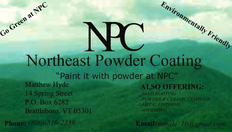
The ALSO OFFERING section of your business card says you do more than just powder coating, so why leave powder in the title at all? Just Coatings should suffice. Green Mountain Coatings or something along that line would be a much more appealing brand name if you ask me.
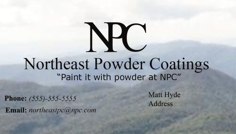
Now regarding the business card...
First of all, the background image is full of JPG compression artifacts. Find a better source image! It can't be that hard to find a rolling mountainscape!
The black on green is impossible to read, and will only get worse when printed. Try adding a few pixels of white stroke to the layer, or outer glow.
Does being "green" have to be on the card twice? Your card should be concise and to the point. I would add it to your list of "things we do", if at all. That's the kind of thing you put on your website or advertise at the store.